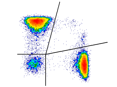
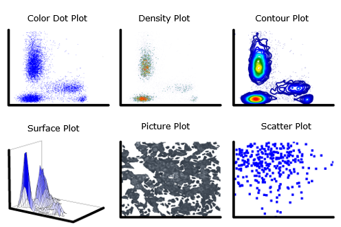
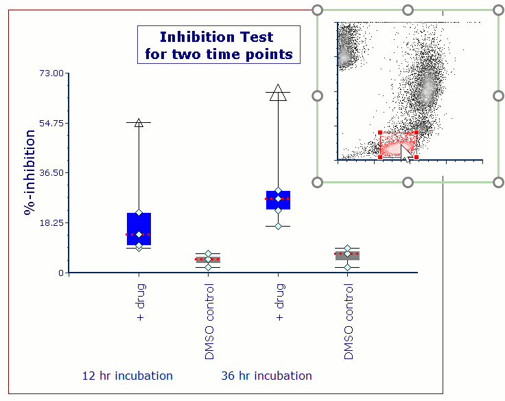
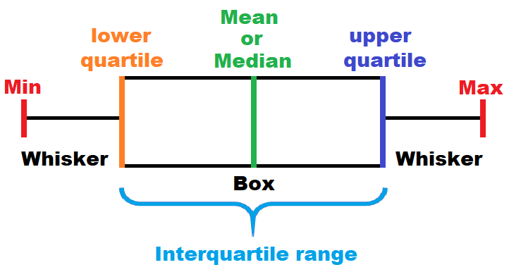
Summary Charts help visualize the central tendency of the data (e.g., Mean or Median), along with the distribution of the data, including outliers and single data points, if desired. Summary Charts in FCS Express include Box and Whisker, Violin, and Beeswarm plots.

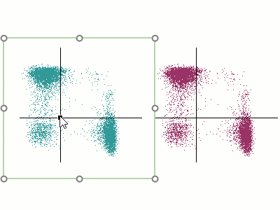
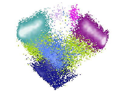
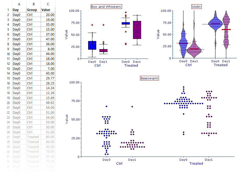
Summary Charts are built from an existing Spreadsheet in your layout. The Spreadsheet must contain Category and Values parameters that may be directly linked to your data. Optionally Group and Color parameters can be added. For each Group parameter, the data within each Category parameter will be graphed as a separate box and whisker, violin, or beeswarm within the Summary Chart (as appropriate for your selected chart type). The Color parameter can be used to define the fill of the box, violin, or bee as shown below.
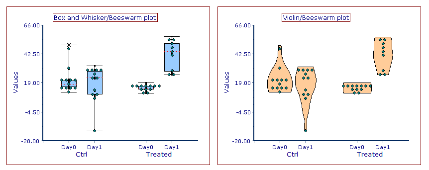
All elements (color, line, outliers, etc.) of Summary Charts can be fully formatted to your specifications. You can even create hybrid-type plots that mix the formatting elements each kind of Summary Chart (e.g., Beeswarm with Box and Whisker [below left] or Violin [below right]).
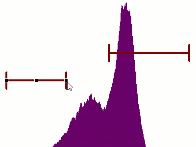
Additionally, Summary Charts will update automatically in response to moving gates and other changes made to the data set (see the live-updating Box and Whisker example at the top of this page). The direct link of the Summary Chart to your data means that even if adjustments are made to the analysis strategy, including gating changes and data reorganization, the plot will accurately reflect changes WITHOUT having to be remade. This enables users to move from data analysis to RESULTS quickly and easily.