Real Time Charting

FCS Express offers integrated graphing tools that link directly to your flow cytometry gates

If you find yourself copy and pasting out to Excel and other graphing software with your current analysis tools, only to do it again and again when a gate change is requested, then your not alone. FCS Express eliminates the middle man by utilizing Excel-like spreadsheets built directly into the software that link up with your gates and statistics so you can skip the copy and paste and get results in real time.

Pie Charts

Pie Charts facilitate the visualization of relationships between statistics and how they combine to form a conceptual whole.  Rather than export your flow cytometry data to a spreadsheet or other graphing program, simply insert a Pie Chart in FCS Express and watch as it updates automatically with your gates, markers, quads, and .fcs file data.

Bar Charts

Bar Charts update immediately as your analysis changes including standard deviation bars. Bar Charts are fully formattable within FCS Express, eliminating the need to use additional software programs to achieve your results.

Scatter Plots

FCS Express has built-in Scatter Plots that update in real time when gates are adjusted. Data from Scatter Plots can be overlaid from the same or multiple flow cytometry experiments. Scatter Plots are fully formattable, including dot, error bar, and all other plot properties.

Scatter with Regression Plots

FCS Express can display your flow cytometry data as a Scatter with Regression Plot when performing a time-course study, dose-response curve, or other quantitative experiment. Choose from many available equations to fit your data and watch the curve update in a batch process or as you adjust your gates!

Regression Analysis

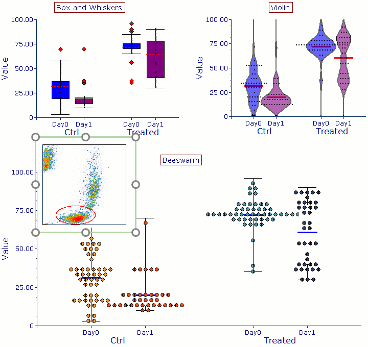
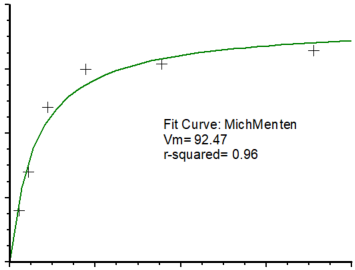
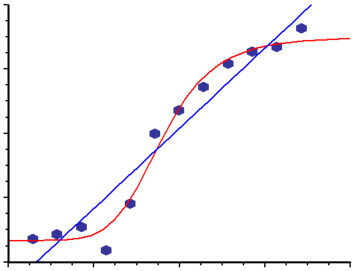
FCS Express enables the calculation of regression fits directly from your gates and statistics. You can overlay a regression with the click of a button. Most importantly, your regression formulas, line fits, and analysis can all be linked directly to your flow cytometry data allowing you to view changes to your regression analysis in real time as gates and data are adjusted.

Levey-Jennings Plots

With Levey-Jennings plots, you may visualize quality control data to ensure test metrics are stable over time and fall within a predetermined range. The range, more commonly referred to as the control limits, allows the test metric to be assessed based on whether the values fall within the range or outside of the range. Values falling outside of the control limits are considered "out of control" and when occurring on consecutive measurements can indicate the accuracy of the test metric has shifted.

Other Summary Plots

Box and Whisker, Violin, and Beeswarm Plots are new additions to enable you to see the central tendency and distribution of your data.